Our Work
BOH
Kuwait
Communications

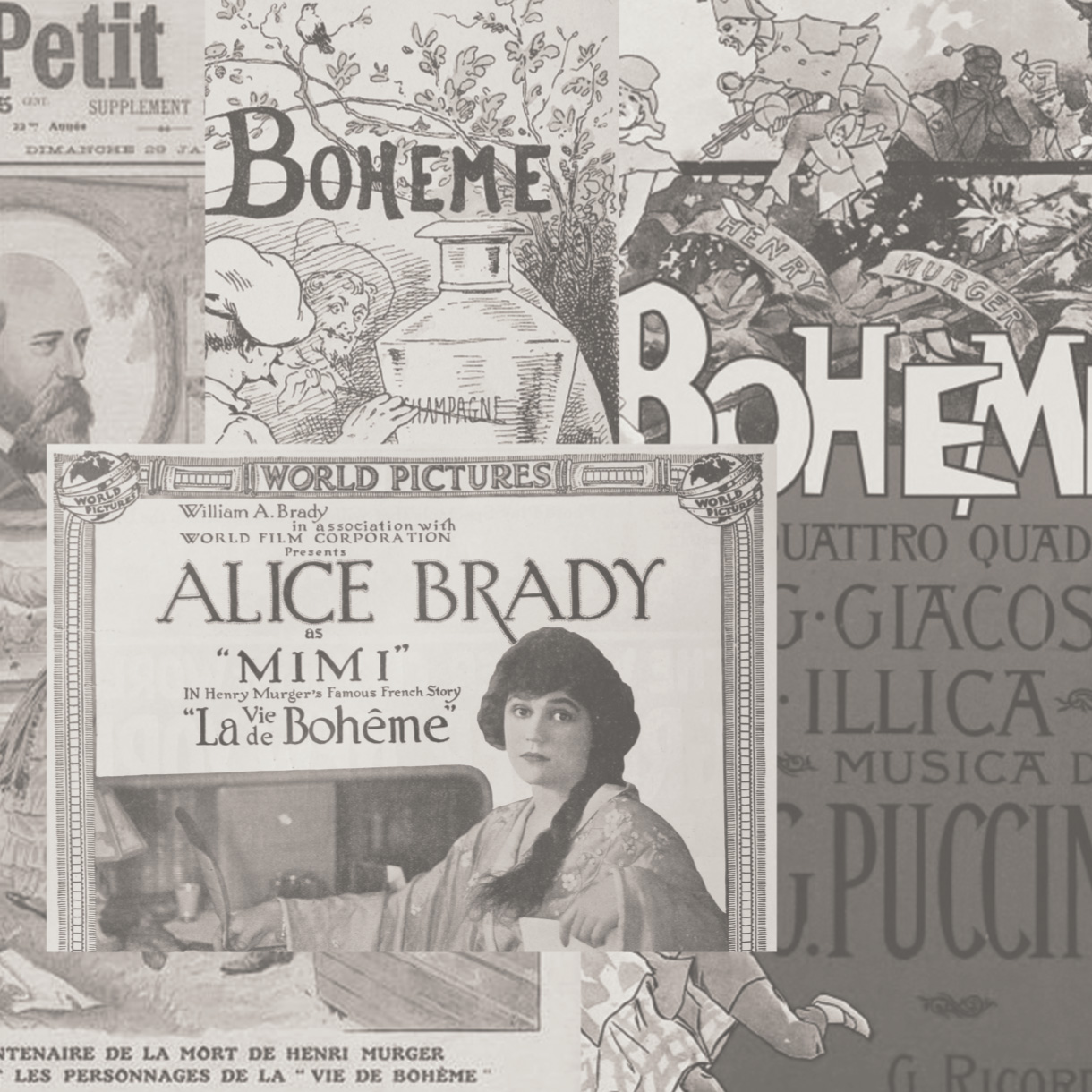
BOH is a modern brand management agency with a unique perspective. We combine data-driven strategy with a touch of bohemian flair, inspired by the artistic spirit of Paris during the early 20th century. Our logo and branding will reflect this duality, capturing the essence of both worlds.

Bōh is a luxury communications consultancy that helps brands break the mold and stand out from the crowd.
We offer a unique blend of creativity, strategy, and execution to help our clients achieve their business goals.


Visual Comms, Eye-catching, with a strong focus on storytelling.

Visual Identity, Minimal, with a strong
focus on detail.


Brand Color Scheme
Boh’s brand identity is grounded in earthy hues, inspired by the natural world. The logo, consistently monochromatic, anchors the palette. Quartz Grey, reminiscent of rugged rock, and Grullo Beige, echoing the warmth of stone, serve as primary colors. These grounding shades are then complemented by secondary colors that infuse life and vibrancy: Thyme Green, a nod to lush foliage, and Blue Grey, evoking the calming essence of water. Together, these colors create a harmonious balance, reflecting Boh’s connection to nature and its commitment to simple, enduring design.


Illustration Style
Boh’s brand illustrations embody a minimalist aesthetic with a focus on abstract shapes derived from photography. Inspired by the natural world and feminine forms, the illustrations utilize the brand’s earthy color palette, incorporating soft curves and organic lines to create a sense of harmony and flow. The abstract shapes, while seemingly simple, are thoughtfully composed to evoke emotions and tell stories, aligning with Boh’s commitment to understated elegance and natural beauty. This unique visual language sets Boh apart, creating a cohesive brand identity that resonates with its audience on a deeper level.


